After earlier research of navigation keys i now feel highly capable of creating my own. This will entail one home page and then five sub-pages. The pages i have included are those that both my secondary research and questionnaire results both demonstrate. I have made it so on each page of my website you have access to the navigational box and therefore, navigation around my site will be easy.
Sunday, 17 October 2010
Questionnaire Analysis. . .
1) This graph shows that more females have filled in the questionnaire then males. Ideally we should have given the questionnaire to equal numbers. However, due to the random sampling technique used, this did not happen. Nonetheless, it is only a 3% difference so should give no real bias to our results.
2) This graph demonstrates that our target audience ranges from 14 – 19, this means that our results will be suited to them, representing their views and opinions on what they want from our trailer, poster and website.
3) This graph clearly shows that the vast majority of population asked do participate in watching films so therefore be able to provide individual knowledge, experiences and opinions.
4) This graphs shows that the majority of people watch films at the cinema monthly, while very few people watch them weekly and yearly. This gives us an idea of when we would release our teaser trailer. So, results would suggest that the trailer should be released around a couple of months before full length release.
5) This clearly indicates that people do research about a film before viewing it. So therefore, it shows that there is a need in the market for advertising techniques such as the website we will create as well as being effective.
6) The most popular of film poster highlighted by these results are Pirates of the Caribbean and The Crazies. Surprisingly, these two posters follow very different conventions. Both show no real image of any characters however; demonstrate an iconic image of the film. So this is defiantly something I will need to consider in the production of my poster. Both of the posters have placed the text towards the bottom of the page and follow a sinister theme, suggested by the use of low key lighting. This shows that horror/thriller posters are an effective method of advertisement, building confidence in our genre choice. However, looking at similar posters of these genres from the questionnaire results are low. Looking at these posters, they include more text and reveal an actual image of a character. Suggests that this should be avoided.
7) This graph tells me that when producing my film poster I should spend a lot of time and high levels of detail in the creativity and production of the main image. However, while results suggest this, I will be sure to still take as much pride and care in all aspects of my film poster.
8) These results highlight the features of a magazine people find least important. I found these to be font and background. So therefore, I may include less text on my poster as it has little influence on the success of my poster and draw more attention to areas such as the main image.
9) Again these results show me that my final productions of my film poster, website and teaser trailer are affective methods of advertisement within the real industry. However, 13% said that it depends on the advertisement. Proposing that for my productions to be effective I will need to meet the standards expect and a level of professionalism.
10) This graph shows me that maybe we do not need to have our production on the name of a major production company so gives us the option of creating our own individual production company and logo.
11) This result again backs up the value of the website I will be creating and its influence within the real market. Also, we can see that television has the greatest result suggesting that the teaser trailer we create should also be distributed on the television as well as cinemas. His enables us to access a larger audience and therefore, an increase in the potential target market of our film.
12) Looking at the most popular choices we can see that all are male. This leads us to believe that maybe if not the main character then one of the leading roles should be a male. Each of the character also has in the past been associated with the main stream productions of horror/thriller. Providing us with an idea of what an audience wants to see from actors from such genres.
13) Prior to this questionnaire we as a group had already decided on the genre of horror, but we felt that we should ask this question as it would identify what genre a larger number of people are interested in. Fortunately, results showed that horror was the most popular. This shows us that we had made the right choice of genre and that it is one that people will be interested in.
14) This demonstrates a number of various feelings an audience expects to encounter when watching a film. Out of these I selected ones which related the genre of horror/thriller; suspense, scared, fear, surprise, excitement and confusion. Knowing this would allow us to focus my and the groups productions around these emotions and best attempt to create these feelings from the audience.
15) Trailers, pictures, cast and synopsis were the highest results of this question. This tells me that these pages will be essential to include in the production of my website, meeting the demand of the target market. However, in my website I would also like to include something not mentioned in order to add something new to the pages in order to stand out that bit extra.
16) Results of this question demonstrate that genre, cast, recommendations and narrative are the most important criteria when choosing a film. Thinking realistically, the cast of our cast are likely to not be known at all due to expenses. However, we will be sure to have included those who are highly capable actors/actresses in order to meet the requirements of such standards as best we can. The genre we have already established as the correct decision due to our groups and the peoples asked most popular choice. The narrative of our production will have to be to the best of quality; however, as we are producing a teaser trailer, we should give no chronological narrative away.
17) This demonstrates that red, black and white are all very popular colour schemes. Luckily, this relates very well with our chosen genre and should be taken into consideration in the production of our poster and website.
18-23) These graphs demonstrate what the audience see as most important in a number of aspects of the advertising campaign as a whole. Looking at these results the importance of iconography and soundtrack has been highlighted. This proposes that close attention should be paid to the codes and conventions of my chosen genre and that they should be demonstrated throughout my advertising campaign in order to illustrate the effectiveness of my productions.
Friday, 15 October 2010
Final Title. . .
Sundays Child poem AKA Mondays child |
Mondays child is fair of face, Tuesdays child is full of grace, Wednesdays child is full of woe, Thursdays child has far to go, Fridays child is loving and giving, Saturdays child works hard for his living, And the child that is born on the Sabbath day Is bonny and blithe, and good and gay. |
The name of our production relates both to the religious and childhood focus of our film plot.
The name is influenced by the nursery rhyme above, intended to teach children the days of week. ‘Sabbath day’ refers to the religious day of rest whereby God had finished creating the world and respites. This is ironic as it is as though Gods creation of human life is being undone i.e. death of the children. This therefore relates to the religious theme of our plot without giving too much away, captivating the audience to find out more.
Before we had decided on this title we had a number of initial film names with to suit our story and genre, the option are as follow:
The Unholy
The Crucified
The Haunting of Molly Bell
Unholy
The Reaping
Unsanctified
Illuminati
Sunday's Child
Sinners
The Crucified
The Haunting of Molly Bell
Unholy
The Reaping
Unsanctified
Illuminati
Sunday's Child
Sinners
However, after much though we decided that many of these names would give too much away about the plot of our film, i.e. the religious reference. We also faced a problem, as ‘The Unholy’ was already a film made during the 1980’s which meant we were unable to use it. After further discussion we carried out a small scale questionnaire asking people which they thought best suited our plot and worked well as a film title.
Editing Process
We downloaded the original font style from the website Datfont, we choose the font 'pieces of eight'. As you can see the style of the font itself resembles a Gothic representation with its bold letters and sharp edges. We then copied this font into the program Fireworks. We chose this program as we all had previous experiences in the editing of both text and images from our previous year studying media. As you can see below we applied a vein texture onto the lettering, this texture resembles a torn tissue, especially due to the layer colour of a bloody red. The title now clearly represents the genre of the film as well as an indication to its content, ie. blood, gore etc.
BEFORE
AFTER
Thursday, 14 October 2010
Choosing a logo. . .
After researching a number of production companies’ logos, I have gained key knowledge and understanding of the typical conventions and how it represents the institution.
After a group meeting we came up with a number of logo titles, these included:
- Predator Productions
- Sinister Studios
- Unhinged Pictures
- Dark Path Productions
To decide on the final name of the production company we carried out a small scale survey, collecting a tally count of people’s opinions of their favourite title. The findings showed that “Dark Path Pictures” was the most popular choice by a substantial amount. Trusting this quantitative data, this is the chosen title we have decided on.
As our media production genre is focused around horror and thriller we can see “Dark Path Productions” relates strongly to this. The representation of “Dark Path Productions” suggests that the production will have a sinister and dark nature. The “Path” suggests that the main protagonists will have an extensive journey ahead of them. As well as not giving the audience no clues to what lies ahead and proposes that the audience are proactive in this journey.
Wednesday, 13 October 2010
Creativity
Creativity is:
A unique selling point
Imagination turned into reality
Changing the emotion/ big impact
Un-original ideas
Confronting stereotypes/ deviating from codes and conventions
Attention to detail
Progress on genre/ an adaptation of an original idea
Something the audience does not expect to see
Friday, 8 October 2010
Film Production and logo institutions
These logos all represent mainstream production companies that have some of the largest influences on the film industry. Looking at these institutions logos enables me to get an idea of the type of logo we can create for our media production.
Looking at the Universal logo we can see that there is gold surrounding the text. This colour demonstrates that the company produces high expense films, meaning they will be of a high standard. Gold also refers to the valuable metal, proposing that their productions are seen as precious and an asset to the audience. Gold is also used in Paramount and Columbia
Looking at the text throughout the logos we can see that most only reveals the name of the film, all of which written in a very clear bold font. This allows the logo to be easily read, and to remain vivid in the viewers mind. However, Paramounts text is really quite small and written in an italic style. This is effective as it sets itself aside from the other institutions creating originality in their commodities. The italic font also suggests that their films follow prestigious standards.
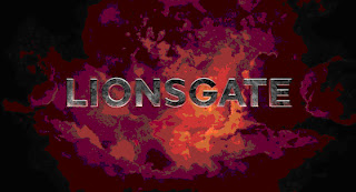
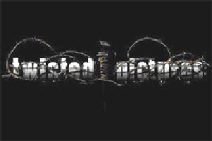
Each of the five logos gives a representation of their productions and the institution itself. Universal logos iconic image is the world surrounded by space. This suggests that their films are known and enjoyed world wide. Columbia and Paramount pictures logo both include a powerful and influential image, the mountain peek represents that the institution has carried itself to the very top of the industry and now overlooks all, the stars surrounding the mountain may relate to the star rating critics of films, by consisting so many it proposes that their productions are to a whole new standard. The lady holding the touch draped in the American flag represents the state of Columbia and stands for the American dream, suggesting that the institution gives the audience a chance for there dreams to come true. Lioinsgate logo contains no real image only a cloudy background. This suggests this institution is the silver lining in the clouds, meaning their productions will beat all around them and what they offer is just what the audience was looking for. The last logo, twisted pictures is the one that relates most to horror/thriller movies and this is immediately recognised due to the barb wire graphical feature. Barb wire, a sharp metal usually used to keep something in or out is wrapped around the text. This suggests that within the movies they create, there is not much hope for the innocent to escape and pain and hurt is likely to be inflected upon them. The name ‘Twisted pictures’ proposes the content of the film will be bitter and cruel, unsettling the audience when first recognised.
Subscribe to:
Posts (Atom)


