y research has provided me with the knowledge of typical conventions throughout existing media products in teaser trailers, posters and websites. Between the three of my media products I have consistently used, developed and challenge these conventions. http://lewis-tillyer.blogspot.com/2010/09/purpose-and-conventions-of-teaser.html
Firstly, the narrative of my teaser trailer follows the conventions of existing media products from the same genre. Although material from the film industry traditionally follows Todorov’s narrative stages, my research identified that this was not the case within all of horrors’. For example, there is more disruption and recognition of the equilibrium is not always evident. However, as I am producing a teaser trailer the narrative structure itself was kept unclear from the audience. This is typical of a teaser trailer as its purpose is to ‘tease’ the audience, by providing only segments of narrative stages the audience is left guessing and questioning what is going to happen. http://lewis-tillyer.blogspot.com/2010/10/our-stages-of-narrative.htmlThe content of existing trailers of our chosen genre mainly involved the disruption stages and the use of enigma codes. We also need to consider the genre of the trailer, for this reason our trailer consisted of a very short sequence of shots in order to establish the equilibrium and then a great deal of time on the disruption. This keeps the audience entertained and enticed to find out the reason behind the disruption or who is next. All these questions put into the audiences mind represent desired emotions of a horror trailer encouraging them to watch the whole length picture. For example, audiences of our trailer are left what happens to the main protagonist? Who the villain is?
As well as the narrative, another major convention of any teaser trailer not only horrors’ is the length. Typically the length of a teaser trailer is between 30 and 90 seconds. Originally we had difficulty reaching this target as we had a lot of footage (144 takes) and we were reluctant to lose footage we favoured. However, after much thought and audience feedback we identified that this was a major issue of our teaser trailer. So what we decided to do is create two versions of our trailer. One, being longer we used as our theatrical trailer and the shorter as our teaser trailer. After a lot of editing we eventually managed to cut the trailer a significant amount. In the end conforming to this convention improved our teaser trailer dramatically, making the whole thing more intense and fast pace.
 Another way in which we conformed to conventions of existing products is the use of characters. From my research I identified three main character types according to Propp; the villain, donor, helper and the hero in such genres. In addition, we decided to only really represent the hero and villain within our trailer. However, while we follow typical conventions of the villain character i.e. male, tall and powerful, we have developed or even challenged the hero character type. We decided to make the hero female as this would be more effective based on the narrative of our story. Typically female characters follow stereotypes such as vulnerability and dependency, while our trailer represents the female character as independent and brave. We have conveyed this within our teaser trailer as even though the character is in potential danger she still strives to expose the villain and save her younger sister.
 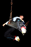 During my research, in particular the analysis of existing teaser trailer I found that horror teaser trailer typically used numerous transitions and visual effects in order to emphasise the featured events. When producing our teaser trailer we took this into account and therefore used a variety of transitions, for example, although we maintained a desired fast paced trailer using wipe cuts we also included transitions such as flash and wipe cuts. This adds to the effectiveness and allows the trailer look more professional. However, some visual effects used in horror trailer we just simply did not have access or the experience of generating due to the editing software used. As well as transitions shot types were also important. Throughout our trailer we use a vast number of shot types. However, one shot type we used which our trailer takes one step further of existing products is the close up of the child victims. We added this to our trailer as we felt it would have more of an emotive impact on our audience. However, one issue this generates is that it limits the time of day that the trailer can be shown, due to the access of age to the audience.
 Typically within a horror/thriller teaser trailer the use of sound use revolves around having one non diegetic sound track playing consistently throughout however increasing in pace as well as volume. Also, they usually consist of a number of sound effects in order to emphasise key points of disruption within the trailer. Within our trailer we used two separate sound tracks developing typical conventions of existing products. We did this in order to make a clear distinction between the equilibrium and the disruption. We found this effect successful as it made the audience feel a false sense of security as well as demonstrating a strong sense of community central to the film’s narrative. http://www.youtube.com/watch?v=-TGKJ9MgCOQ However, once the disruptive soundtrack began the music became louder and more dramatic increasing with the timing of the edits. We also used many sound effect, most of which consisted of a heavy bass line and even the use of parallel sound in a power cut. http://www.youtube.com/watch?v=BVRgEi6SooU&playnext=1&list=PLBC26F0701C1D0314
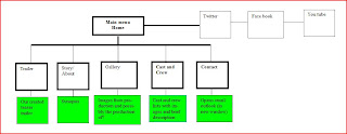 The actual navigation around my website follows a typical map of any website. However, due to my past experiences in the creation of websites the navigation it is quite simplistic. Nevertheless, this has proven to become some what of an advantage. My website is extremely easy to pilot around the pages, making the website effective for all audiences whether they are confident in the ability to use a website or not.
 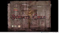 From my research I also found that websites typically had a range from four to eight pages. For this reason I decided to include six pages, I felt that this enabled to provide the most important information without adding unnecessary information which are likely to be avoided. The actual content in which each page provides was selected from my past experiences with typical film websites, I also decided to include and index (welcome) page as in my research I found that although independent films often did not include this page, more mainstream websites did. So therefore, by including this page I felt that my production appeared more professional. One way in which the content of my pages has developed typical conventions is by including both my teaser and full length trailer rather then just the one. This gives the audience more control and choices to how they use the website, for example, those who have little time are likely to choose the teaser, while those who wish to gain a more detailed interpretation of the film with the time have the option to do so.
 The last of my tasks within my media production I created was my poster. I decided to predominantly follow typical conventions and layouts of existing products due to the limited features on a poster and in order to make it clear to the audience what product it is. Throughout my poster I focussed on suggesting and implying the narrative of our film throughout the media language. I achieved this in many ways, for example, like my previous products mentioned I used features of mise en scene typical of my genre i.e. props (mask), colour (red, white and black), and font. As well as this I include a slogan; ‘every village has its secrets’. I believe this is effective as from my research I found that other posters included a slogan which may get the audience to feel vulnerable, apply the situation to their life. The slogan I have included does exactly this. Firstly, any audience member that reads it and lives in a small town or village can relate to the location the film is it, the idea that secrets are being hidden is a concern or worry to any person, every person has done something they wish to be kept hidden. Therefore, it causes the audience to question the security of themselves.
 The actual navigation around my website follows a typical map of any website. However, due to my past experiences in the creation of websites the navigation it is quite simplistic. Nevertheless, this has proven to become some what of an advantage. My website is extremely easy to pilot around the pages, making the website effective for all audiences whether they are confident in the ability to use a website or not.
  From my research I also found that websites typically had a range from four to eight pages. For this reason I decided to include six pages, I felt that this enabled to provide the most important information without adding unnecessary information which are likely to be avoided. The actual content in which each page provides was selected from my past experiences with typical film websites, I also decided to include and index (welcome) page as in my research I found that although independent films often did not include this page, more mainstream websites did. So therefore, by including this page I felt that my production appeared more professional. One way in which the content of my pages has developed typical conventions is by including both my teaser and full length trailer rather then just the one. This gives the audience more control and choices to how they use the website, for example, those who have little time are likely to choose the teaser, while those who wish to gain a more detailed interpretation of the film with the time have the option to do so.
 Also, relating to the navigation around my website, I decided to place my navigation bar towards the top of each individual page. From my research I also found that in the horror genre in particular, the navigation bar ran horizontally, I followed this convention as a vertical takes up a large portion of space so would take away the audiences attention from the main image or content of the page itself. Just above the navigation bar I placed the final edited title of my movie, this is an important feature of my website as it creates continuity between the other products. I also noticed from my research that websites often used a number of visual effects and behaviours. However, due to the program I used to create my website many of these option available were quite tacky, for this reason I therefore decided to only use those which did not have an impact on the professionalism of my product. One example of where I used visual effects was in my title; a fast paced light skipping within the letters. I used this behaviour as it represents a struggle between good and evil, the light resembling good is trapped and surrounded by evil.
When I first designed my website I used one image/wallpaper consistently throughout all but the index page of my website. This was due to me using mini pages rather then individual pages. After, looking back at my research I found that mainstream horror websites did not use this format of page; instead each page was independent and included a different picture. Due to the effectiveness of the convention I decided to follow this method, on each page I included a different picture while still representing the same meaning and consistency of genre representation. I achieved this by including typical features of mise en scene sc as expression, props and lighting. As well as this I also made my website interactive, i.e. the audience selects what to view and navigation around the site.
However, one convention I noticed was typical of horror websites was that between the transitions of pages, a short piece of footage from the movie is played. However, from navigating around the websites myself I would often skip this footage as it became more of an annoyance rather than a positive feature. Other issues I faced including this feature was that I felt we had not gained enough footage to include it on the website as similarities would be evident between the trailers. As well as this, the program I used did not offer the tools in order to do so. If I was to complete the website again, I would consider adding this convention however, due to my technology restrictions this was not possible.
 The last of my tasks within my media production I created was my poster. I decided to predominantly follow typical conventions and layouts of existing products due to the limited features on a poster and in order to make it clear to the audience what product it is. Throughout my poster I focussed on suggesting and implying the narrative of our film throughout the media language. I achieved this in many ways, for example, like my previous products mentioned I used features of mise en scene typical of my genre i.e. props (mask), colour (red, white and black), and font. As well as this I include a slogan; ‘every village has its secrets’. I believe this is effective as from my research I found that other posters included a slogan which may get the audience to feel vulnerable, apply the situation to their life. The slogan I have included does exactly this. Firstly, any audience member that reads it and lives in a small town or village can relate to the location the film is it, the idea that secrets are being hidden is a concern or worry to any person, every person has done something they wish to be kept hidden. Therefore, it causes the audience to question the security of themselves.
No comments:
Post a Comment