Mondays child is fair of face,
Tuesdays child is full of grace,
Wednesdays child is full of woe,
Thursdays child has far to go,
Fridays child is loving and giving,
Saturdays child works hard for his living,
And the child that is born on the Sabbath day
Is bonny and blithe, and good and gay.
The name of our production relates both to the religious and childhood focus of our film plot.
The name is influenced by the nursery rhyme above, intended to teach children the days of week. ‘Sabbath day’ refers to the religious day of rest whereby God had finished creating the world and respites. This is ironic as it is as though Gods creation of human life is being undone i.e. death of the children. This therefore relates to the religious theme of our plot without giving too much away, captivating the audience to find out more.
Before we had decided on this title we had a number of initial film names with to suit our story and genre, the option are as follow:
The Unholy
The Crucified
The Haunting of Molly Bell
Unholy
The Reaping
Unsanctified
Illuminati
Sunday's Child
Sinners
However, after much though we decided that many of these names would give too much away about the plot of our film, i.e. the religious reference. We also faced a problem, as ‘The Unholy’ was already a film made during the 1980’s which meant we were unable to use it. After further discussion we carried out a small scale questionnaire asking people which they thought best suited our plot and worked well as a film title.
Editing Process
We downloaded the original font style from the website Datfont, we choose the font 'pieces of eight'. As you can see the style of the font itself resembles a Gothic representation with its bold letters and sharp edges. We then copied this font into the program Fireworks. We chose this program as we all had previous experiences in the editing of both text and images from our previous year studying media. As you can see below we applied a vein texture onto the lettering, this texture resembles a torn tissue, especially due to the layer colour of a bloody red. The title now clearly represents the genre of the film as well as an indication to its content, ie. blood, gore etc.
After researching a number of production companies’ logos, I have gained key knowledge and understanding of the typical conventions and how it represents the institution.
After a group meeting we came up with a number of logo titles, these included:
Predator Productions
Sinister Studios
Unhinged Pictures
Dark Path Productions
To decide on the final name of the production company we carried out a small scale survey, collecting a tally count of people’s opinions of their favourite title.The findings showed that “Dark Path Pictures” was the most popular choice by a substantial amount.Trusting this quantitative data, this is the chosen title we have decided on.
As our media production genre is focused around horror and thriller we can see “Dark Path Productions” relates strongly to this.The representation of “Dark Path Productions” suggests that the production will have a sinister and dark nature.The “Path” suggests that the main protagonists will have an extensive journey ahead of them. As well as not giving the audience no clues to what lies ahead and proposes that the audience are proactive in this journey.
We have recently begun developing illustrations of potential logo imagery.We have found it difficult to create an image that we feel truly demonstrates the institutions implication. . .
Finally we have created our production company logo
These logos all represent mainstream production companies that have some of the largest influences on the film industry. Looking at these institutions logos enables me to get an idea of the type of logo we can create for our media production.
Looking at the Universal logo we can see that there is gold surrounding the text. This colour demonstrates that the company produces high expense films, meaning they will be of a high standard. Gold also refers to the valuable metal, proposing that their productions are seen as precious and an asset to the audience. Gold is also used in Paramount and Columbia pictures again indicating their high status and place within the industry. Another common colour is black, representing the boldness and power the institution holds within the market. We can see that the Lionsgate logo consists mainly of red. This has countless both positive and negative connotations; love, passion and sexiness all indicate that the films they produce attract the audience and will always get pleasure from the films.
Looking at the text throughout the logos we can see that most only reveals the name of the film, all of which written in a very clear bold font. This allows the logo to be easily read, and to remain vivid in the viewers mind. However, Paramounts text is really quite small and written in an italic style. This is effective as it sets itself aside from the other institutions creating originality in their commodities. The italic font also suggests that their films follow prestigious standards.
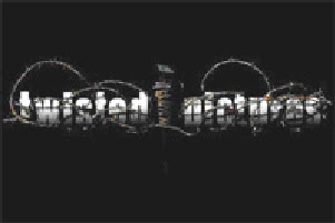
Each of the five logos gives a representation of their productions and the institution itself. Universal logos iconic image is the world surrounded by space. This suggests that their films are known and enjoyed world wide. Columbia and Paramount pictures logo both include a powerful and influential image, the mountain peek represents that the institution has carried itself to the very top of the industry and now overlooks all, the stars surrounding the mountain may relate to the star rating critics of films, by consisting so many it proposes that their productions are to a whole new standard. The lady holding the touch draped in the American flag represents the state of Columbia and stands for the American dream, suggesting that the institution gives the audience a chance for there dreams to come true. Lioinsgate logo contains no real image only a cloudy background. This suggests this institution is the silver lining in the clouds, meaning their productions will beat all around them and what they offer is just what the audience was looking for. The last logo, twisted pictures is the one that relates most to horror/thriller movies and this is immediately recognised due to the barb wire graphical feature. Barb wire, a sharp metal usually used to keep something in or out is wrapped around the text. This suggests that within the movies they create, there is not much hope for the innocent to escape and pain and hurt is likely to be inflected upon them. The name ‘Twisted pictures’ proposes the content of the film will be bitter and cruel, unsettling the audience when first recognised.
The trailer begins by presenting the production company of the movie, ‘Warner Bros. Picture’ logo, in time with a non dietetic heavy beat of a drum. By first establishing the studios of the film, the audience are reassured that the following film will follow the high standards of the company, acting as a form of a stamp of approval. So from the very beginning of the trailer, the audience are settled and have great expectations. The logo itself has been edited as the outline appears to be filled in with high raised building, representing a city. The camera then zooms into this logo suggesting that the upcoming film is one the studio is most proud of, within the heart of the company as well as being centred in an urban environment.This then gradually dissolves out to reveal the text ‘from Christopher Nolan ’ again in time with a drum beat, through listing director of the production the expectation of quality is maintained in the viewers minds.
Alongside the heavy beat as the trailer edits from scene to scene and echoing throughout sinister music is played, at this point it is very minor, only consisting of a screech of a violin. This immediately establishes the genre of thriller, and tension is being built from the very beginning of the trailer. This opening scene fades in and consists of a close up shot of a spinning top spinning unbalances on a table top. This suggest that within the film not all will run as expected and there could possibly represent an imbalance between good and evil. The camera then quickly edits before we see the spinning top land giving no clues to the outcome of this imbalance. ‘From the directors of the Dark Knight’, is shown over a black background. The Dark Knight is one of the most recent and most popular of thrillers so again just increasing the expectations of this film even greater. As the trailer straight cuts to the next scene, a more thunderous sound effect is used as we are revealed to a bird’s eye view of a city location through a helicopter shot. This city may relate to the logo earlier in the trailer suggesting that this is where the centre of upcoming event is likely to occur.
The camera then straight cuts to reveal a mid shot of the main character. In time with this, the sinister music becomes more dominant and at a lower tone. This suggests that this character is one who will encounter or be the main source of disruption within the film. The next scene is very short and consists of a character being taken away by two male character wearing black suits. It is also raining, following pathetic phallic is the character scrounges to escape. This then dissolves out and the text ‘Leonardo Dicaprio’ is shown for a shot period. This is a world famous actor known by most, so by displaying his name it attracts fans of his previous films to the movie, widening the potential target audience. The next scene is very brief where we see a half full glass of water of a table surface. However, unexpectedly the water surface is not level or settled, this is the audience first encounter with unexplainable causes and leads suspicion to how this is happening, enticing the audience deeper into the trailer.
It then straight cuts to reveal a street view level camera shot as the camera tracks through an urban street slowly canting horizontally, seeming to follow the text ‘your mind’. This now suggests that rather then looking at the city from above we are now in the depth of the coming events. Low key lighting is used to create this sense of fear of the unknown. The camera gradually canting along with ‘your mind’ suggests that what you would first think or expect will be turned on its head. The scene then slowly fades exposing the main character once more as he turns to face the camera in this low key lighting. In this shot of the character we can see in the background, a city environment possibly suggesting that it is this character that is causing the unexplainable events. The camera then straight cuts back to the street view only this time, the camera tracks from a horizontal canted angle running alongside the side of a large city building following the text ‘is the scene of the crime’. This following the prior text featured suggests that the film revolves around power of the mind.
Still the music is building and the rhythmic thunderous strikes as edits are becoming louder and louder bringing even greater anxiety to the audience, preparing them for what’s next. We are then introduced to a new location within a hotel where two characters seems to be struggling for balance in attempt to run towards each other. This can be related to the previous scene of the glass of water as although their surrounding seems normal, there actions indicate an unmanageable and unpredictable environment. It then straight cuts to show the main character gasping for a breath as he pulls himself out of a bath. A slow motion effect is used here to allow the audience to configure just what is happening. We can see that the character is wearing a suit placing further questions into the minds of the viewers. Then it suddenly straight cutting back to the previous scene within the hotel where the two characters are now floating in mid air and grapple each other. This may represent the struggle and fight between good and evil within the film, as well as emphasising this paranormal imbalance. The trailer then briefly edits to a close up of a watch where time seems to be moving at a faster rate then expected. This gives the impression that the good are running out of time. It then instantly cuts back to the fight where they are now falling from ceiling to floor stilled grappled followed through a tilt shot. Then, editing to a canted angle where one of the character holds onto the wall while the other appears to be falling. This shift in gravitation may suggest the possibility of a new world, or a disruption in the equilibrium of our world. The next straight cut reveals us again to the main character, but this time it is as though he has woken up. This proposes that the mind weapon mentioned earlier in the trailer is his and he is the cause of such explainable events, or even that this is all the witnessing of a dream. Throughout this final section edits became much faster and music becomes even more sinister along with the recurring beat getting louder and faster. All this techniques overwhelm the audience, emphasising the fast paced impression the trailer puts across.
The trailer then again straight cuts to a close up of an urban building in low key lighting to then track really fast up the sky scraper and continues to zoom away until this city landscape spells out the title ‘Inception’. This then looks to represent a maze, suggesting that it will be no easy path and that every move may be a wrong one. The text ‘Summer 2010’ is then featured over a black background, this advertisement of the film release time gives the audience something to look forward to. This is then followed by listing of actors, cast and production companies.
When the trailer begins, we are first shown the production companies allied in the making of the film. Although these are only exposed very briefly, it establishes and reassures the audience of the standard of quality of the movie itself. Determined through the current existing productions the companies are associated with and the reputation created.Both of the companies listed are well recognized in the production of horror movies, so viewers’ expectation will be high.A unique technique is used to display and edits between these scenes. The only way I can think to describe it, is that it represents an old slide illustrator projector, parallel to edits a clicking sound effect is used to identify the change in content on screen, upcoming edits rolling over from top to replace previous scene. This instantly creates a sinister, quirky feel, establishing the genre of the movie.
The trailer then goes on to show a number of various homes in what we would expect is within America. These are shown still using this slide show technique. In time with the first house being shown, traditional 1930’s American music begins. This is unexpected as at first it gives no indication of how this could be related to the genre. However, if you listen closely you can hear that the music has been slowed down ever so slightly suggesting something just isn’t right, the ‘norm’ has been meddled with, so could be related to the disruption of an expected equilibrium. The theme of the past is also emphasised as the muffle of a record player is heard, proposing that history of characters will be made i.e. death of. Under each of the homes shown there is a short piece of text featured explaining characteristic reason why people choose a home. Images of the houses are only small and centred on the screen. As these slides continue, a more sinister music begins and the following text under the next few homes slides, put together reads ‘but some people choose homes for a completely different reason’ As this is broken down into section showing a number of various houses, the lighting becomes low key and the background track becomes ‘stuck’ as well as the music more sinister. This builds tension as well as setting a darker tone to the trailer, the idea that the track becomes stuck suggest that those within this house are trapped, unable to escape. As well as this, there is a circle with a cross placed over the houses; this gives the impression that these last houses revealed to us are targets to someone.
As the last house is shown the music echoes to an end while the image flashes, zooming to full screen as the cross symbol vanishes. This suggests that a target has been selected and this will be where dark intentions will take place. The fact the image also gets bigger suggests that they face a greater evil then those previously selected.
The screen then goes blank for a couple of seconds empathising tension built upon the audience. The trailer then straight cuts between a number of shot ranges and angles where we are established with a couple, where the dietetic sound ‘I love you’ is heard establishing an equilibrium between the two character. Edits are slow as it enables us to become familiar with the two characters. However, this is soon disrupted by a thunderous knock on the door. In time with this we see the characters reaction to this and through expression and body language we predict that they were not expecting anyone and almost startled by the great knock. It then quickly straight cuts to show the door in full sight, all seems normal however; an ever so quite flow of wind is heard. This suggests that the characters are within an isolated area, putting them in even more of a vulnerable situation. The camera then straight cuts to show the female character placing her ear to the door with caution and uncertainty, as she makes contact with the door, a harsh voice whispers ‘your gonna die’. We as an audience now feel unsettled and even frightened for the characters of innocents.
The trailer then goes black for a short period and sound is completely stopped to build intense apprehension, instantaneously it then straight cuts to expose an axe pasting into the door, the dietetic sounds of the axe smashing through the door in one hit is intended to put the audience on full alarm. The idea that these ‘strangers’ have broken the only barrier between we get the impression that the characters are now completely exposed and helpless. The trailer then carries out a number of the fastest edits I think I have ever seen. Sinister music has now re-begun get louder the closer we come to the end of the trailer. The technique they have used is like the very beginning slide illustration method, however much more anxiety is built due to high impact sound effect and the fast passé edits. Each of the edits will reveal about five different still pictures demonstrating the struggle between the good and evil and then pause on a motion picture in time a an ear piercing screech. This repeats three times until finally ending the sequence on the iconic image of the movie shown on the poster whereby the couple are tied up sitting facing the three introduces as they surround them standing. As this happens the music echoes out indicating the end of the action. This last image is one that is likely to stick into the viewers’ mind, where they will remember the film on a distressing ending where the characters were trapped, surrounded, with no hope left. This cliff-hanger gives no evidence to whether they survive or not and leaves the viewer to believe that these killers are still out there, leaving them to feel vulnerable themselves and unsettled even within their own home classically conditioning the viewers to think about the film relentlessly.
The sound then finally fades to an end and there is a slight delay in the straight to show the title of the film on a hand printed cloth canvas, this marking may be used to suggest that real life identities out there are capable of such acts and evidence is closer then you think. Again corresponding to this a theatrical beat sound effect is you to keep the viewers in a state of shock. ‘Inspired by true events’ is then displayed on the screen in order to reassure the audience that they are in just as a susceptible position. The trailer then unexpectedly goes on to show a number of fast passé edits where we see the female character on the floor struggling to crawl away from something, this proposes that maybe the character did escape, leaving the only way to find out being to watch the film. Just before the teaser comes to an end, the two main protagonists’ names are featured. This means that current fans of these actors or actresses may go to watch to the film as they have enjoyed previous productions they have performed in. Maximising a potential target market.
From the very beginning of trailer tension is being built. The opening scene consists of an empty black screen lasting roughly 10 seconds; over the screen a visual effect is used. The only way I can described this effect is that it represents a brake up of signal, nebulous white strips moving around the screen. This effect suggests that all is unsettled. Roughly 3 seconds into this scene, non dietetic footsteps are heard, gradually getting louder as the scene continues. This is an iconic sound technique used in typical horror, thriller productions. This feature suggests that the darkness is approaching, builds anxiety in the audience as it becomes louder. The picture then jump cuts to the very last scene of the first paranormal activity whereby a body is thrown at the camera from across the room, parallel to this there is a great ‘bang’ which enables the first audience to again associated the movie with fright, establishing the genre and concept behind the main motion picture. The idea that someone can be so easily flung across a room raises questions of whom or what could do this? This causes the camera to aggressively shake and go on to the floor, it remains at a canted angle and gradually zooms into the open doorway where the character was thrown from, however, to the viewers surprise, the doorway is empty. This is the first paranormal event of the trailer as no clues are given to how this happened. Again, the ‘fuzz’ effect is used alongside what I would expect is gushing wind, suggesting abandonment of the victims hope and emptiness of this creatures heart.
The text ‘in 2009 you demanded it’ fades in white over a black canvas, almost like the appearance of a ‘ghost’. In time with this a sudden sound effect is used, expectably used to keep viewers on their toes. The scene then wipe cuts using the fuzz effect when we are established with a wide shot revealing an audience watching the original Paranormal activity. It is shown in night vision to allow us to see that the audience is not yet disrupted by the fear of the film, as though an equilibrium has been set. However, this is promptly disturbed as the scene straight cuts back to the prior canted shot of the open doorway, and then suddenly cuts to an extreme close up shot of the possessed female character, edits at this point are becoming much faster in contrast with the action . It then straight cuts back to the audience, this time the audience is clearly troubled as there reaction indicates. Displaying this reaction gives future audience an idea or expectation of the level of effectiveness of the upcoming film.
The scene then again goes black for a few seconds, where we are then introduced with a different location through a montage of CCTV camera shots straight cutting around a house, this effect of CCTV may suggest that they has been previous unsettling occurrences within the house and this has been used as a method to scare off such intruders. On each of these scenes, a time is displayed on the top right side of the screen. This gives a sense of reality causing the audience to feel vulnerable as they feel that upcoming events may later effect them. Edits are slow and there is only natural dietetic sound such as grass hoppers when outside, while a sound effect has been used to indicate the change in scene i.e. to another camera around the house. All seems to be ‘normal’ around the residence until we are established with the kitchen. Although minute, the pots and pans are clanking together, and there is nothing to indicate why. This suggests that although there is this equilibrium, there is a slight disruption, one that cannot yet be explained.
Next, we are made known to a typical infant’s room where all appears to be settled. Inside the room there is a dog facing the door sleeping and an infant lying asleep in a cot. This shot is held for longer then most allowing the audience to familiarise themselves with the environment. Suddenly the iconic heavy footsteps from the beginning become start, once more gradually getting louder. This builds huge suspense as the audience will expect the fright similar to earlier in the trailer where the same effect was used. The rocking chair in the room begins to sway mysteriously proposing that something is within the room. This idea of something being inside the room brings the audience to concern for the vulnerability of the infant in the cot. In time with this, the dog wakes up and becomes alarmed and cautiously moves closer to the door. The concept of the dog becoming unsettled with know clear signs to why suggests that it is something paranormal, unseen to the human eye. It then straight cuts to text ‘nothing can prepare you’ using the personal pronoun ‘you’ in order to alarm the audience and address them directly, putting them in a vulnerable position. It then straight cuts back to the room where footsteps are no longer heard but the infant is now standing in the cot facing the open doorway while the dog is now becoming aggressive, growling whilst stepping back as though threatened. This shot is held for a couple of seconds where it then straight cuts back to text, this time reading ‘ for what’s next’ and then immediately wipe cuts to the living room inside the house where all is silent and still putting the audience at ease as they expect all is well. Then, rapidly in time with sinister thunderous sound effect it straight cuts back to the room where the dog and infant appear missing, only the toy above the cot is moving and a dark female figure is standing in the doorway. This leads the audience to assume that harm has come to the child. This figure is very similar to the one shown earlier in the trailer, only this time the character looks much darker suggesting that whatever has possessed her is now in full control. The use of fast edit and loud strikes frights the audience and empathises the proceedings.
The screen then goes black until ‘2’ first appears followed by ‘Paranormal Activity’ in white bold writing. This text flickers as though disturbed and gradually fades. Once this fades, the website address and company logo appears. Encouraging the audience to visit the website to familiarise themselves with the film as well as promoting the production studios of the movie, i.e. to look into other movies they have produced. Throughout these last scenes there is a voice over. However, the voice speaks no language of which I am familiar with, and in a deep changing tone. This suggests that whatever is speaking is an alien to us and is of no understanding to humans.