Before I had even began to create neither my main task nor ancillary task I analysed an advertising campaign of a film from the same genre, I chose the movie ‘The Strangers’. This would enable me to grasp an understanding how existing media products interlink their products in order to then apply this knowledge to my main task of a teaser trailer alongside my two ancillary tasks. http://lewis-tillyer.blogspot.com/2010/09/analysis-of-strangers-advertising.html
Throughout my trailer, website and poster I focussed on creating similarities between them. I believe that I have successfully created continuity between my products as each can easily be identified as advertising the same media production.
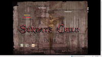
 Firstly, the title of the film is featured on all three of the products as expected. I believe this is one of the most important features of continuity as it provides an iconic identity of the film itself, instantly intertwining the products and recognised by the public. Originally, the first draft of my poster included the same font although it was a different colour. I did this as I thought it best suited the aesthetics of the poster. However, after close analysis I decided to use the original title as it stood out more from the page and consequently provide the audience with quick recognition. Also, I felt that having a consistency of the title between products was a key feature to a new film as it yet to form some kind of identity or place within the industry.
 Other ways in which I feel the contribution of my tasks is effective is by including a slogan, ‘Every village has its secrets’. I feel the slogan itself is very effective as it places questions into the audience’s mind, such as what is the secret? It also has a large impact on the audiences living in smaller communities such as villages as it brings the events closer to reality, putting them in a vulnerable position as it questions whether secrets affect them. As the slogan is also written as a statement I believe that it has more of an impact as it is not only direct but also resembles a fact, there is no escape, the truth is kept hidden. However, although we included a slogan on both the ancillary task we decided not to include it on the teaser trailer. We did this as we wanted to place as much emphasis on the footage and film title itself, adding more text may distract the audience attention from the title.
 On both the teaser trailer and the poster I have also included the production company logo which we had created. As this is clearly a new company we needed to make it clear to the audience of the logo in order to create familiarity with the company through exposure. For example, at the beginning of our trailer the logo is shown for a number of seconds, in order to be most effective for the purpose of the trailer we created a flash moving image of the logo, this adds to the professionalism of our products. While the logo is also featured on the poster, the image is very small due to following the conventional layout of existing posters.
The genre of the film is also suggested throughout the three products through methods such as font colour and low key lighting. The main colour scheme between the three is red, black and white. These are all colours typically associate with our desired genre, so were used to identify our product within this industry. Red suggests danger, blood, anger and the black connotes death, mystery, and the unknown, while white may suggest innocent and purity. As you can see throughout my products the main colour use is black and red. This is due to the dark nature of the narrative which the tasks are advertising. Within the trailer, an example with how we used colour is through the prop of the red balloon. As the child is holding the balloon it suggests that is upon her; close to her. We also used low key lighting was used to represent the disruption and tone of the trailer. Also, throughout my products any use of the colour white is surrounded by black. This was done in order to represent the struggle between good and evil, white representing the innocent being surrounded by darkness suggests that there is no escape, darkness has the dominant upper hand, this provides clues for the audience of the narrative of the full length picture which these products advertise.
 Another effective feature of my productions is the use of image. Each of my productions features an image of the main villains’ prop of the mask. I did this in attempt to create a sense of iconography; people would instantly associate the mask with the movie itself. I wanted to represent the killer throughout my products. For example, this was the dominant image of my poster and I feel the use of editing and camera is very effective. Showing only a section of the mask implies that the character is well hidden so accordingly will not be easily guessed or identified by the audience. Also, being surrounded by darkness to one side suggests that the masked character is approaching from the darkness itself, implying his evil nature. The position of the shadow also highlights the character’s masks features which are almost distorted, suggesting the character has been through many physical contacts. I also decided to add the red tear onto the prop as this is commonly associated as the symbolic mark of a murderer, suggesting the character behind the mask is capable of killing. The mask itself suggests the character behind its identity is kept hidden from not only his victims but the audience, therefore the audience can not simply distinguish who the villain is, but instead it acts as an incentive to watch the film as well as adding a sense of mystery of the killer; a common feature of a thriller in particular. While images of the mask were used, within my website I also included a number of various images mainly based around victims or potential victims of the villain. This therefore creates the idea that while the villain is evident, consequences of his actions are still occurring, there is one particularly graphical image used on the background of one of my web pages. However, during my research I found that including such emotive images is common of my chosen genre.
  Another way I feel I have made my products effective together is through creating textural links or advertisement of each individual product. For example, in my film poster I have intentionally placed the website address in order to encourage the audience to indulge in further interest and research into the film and overall advertise the full length picture. From my website I have then also provided both my theatrical and teaser trailer in order to furthermore promote my film. I also created a sound link between my products. The soundtrack I used within my trailer I also included on my website.
  Also, throughout the productions I also kept in mind the target audience and certificate of the film. This allowed me to adapt my product in the best interests of the potential audience. Carrying out my research provided me with the information to do so. However, I also had to consider the laws and regulations of the certificate 15. So therefore, all three of my media products together or individually will appeal to the same audience.


