Thursday 3 March 2011

How did you use new media technologies in the construction and research, planning and evaluation stages?

New media technology is major part of the film industry today. Throughout my research, planning, construction and evaluation I have used this technology a lot and in many different forms. Firstly, before starting my coursework I created an account using blogger.com. Having used this technology in my previous media coursework I felt confident in using it in order to best express my work towards the project through publishing my posts. Using this method provided many advantages. For example, my peers and teachers have access to my posts electronically where they can then comment providing me with audience feedback. What I also like about this method is that you are able to express individuality and personally by customisation of your page.

During the research stages of my production the internet played a substantial role. Firstly, the internet gave me access to existing teaser trailers, the website that allowed me to do this is You tube; a website which enables people to publish and share their videos globally. One major advantage of using this site was the ability to pause and play, this enabled me to analyse the trailers in sections and at in my own time and therefore go into greater detail. After watching three existing trailers a number of times I then analysed each individually. One limitation of this as a research method is that it is a very time consuming process. However, it allowed me to gather rich qualitative data which provided me with a greater understanding of the typical codes and conventions of a teaser trailer of my genre as well as identifying key skills and techniques used in order to make the teaser trailer effective. This knowledge can then later be applied to our productions in order to be produced in the most professional of standards. I also used the internet during the research stages of my poster and teaser trailer. Again this was to access and analysis of existing products.

During my research I also used the Microsoft Office programs Word and Excel in order to collect and analyse primary research. Within Word I would create a number of questionnaires in order to collect primary research. http://lewis-tillyer.blogspot.com/2010/10/our-questionnaire.html The program was perfectly suited for this purpose, using features such as numbers, tick boxes, lines and creating the questions itself. Using this new media technology enabled me to produce questionnaires in the most time and cost efficient way. For example, prior to the program it is likely that a questionnaire was made in a written format, distributing this questionnaire to a number of target audience members means each will have to be carried out individually, with word and the help of a printer you are able to produce multiple copies in a short time. As well as this, thanks to new media technologies we also had the option of emailing such questionnaires to specific year groups within our target audience. Another advantage is that it looks more professional; therefore, it is likely that those filling out the questionnaire will take it more serious and provide more valid and reliable data. Once the questionnaires were filled out and returned I would then used the program Excel in order to transform their answers into graphs and tables. This enables the collected results to be easily analysed, this improves the objectivity so that they can be best applied to the benefit of our teaser trailer.

During the planning stages of our teaser trailer a number of new media technologies were used. One of the most important areas of planning is producing the storyboard. We decided it would be easier if we created this by hand, as it would allow us to go into greater detail in the sketches and best present our ideas. However, once we had created this we then used a scanner in order to transfer it into an electrical format. Here we were able to copy and paste parts of the storyboard allowing us to produce the best possible story board. Another advantage of making it into an electrical format is that we were then able to put it onto our blog. Here people have access to it and are able to provide us with feedback on its quality. http://lewis-tillyer.blogspot.com/2010/11/storyboard.html

I then started to produce numerous page templates of my poster and website. I used Microsoft publisher to produce three templates for my poster. The reason I choose this technology is due to the availability of tools. On this program you are able to choose numerous shapes and customerisation techniques as well as the ability to move around, copy and paste. Therefore I was able to produce a template to my desire with minimal restrictions. I also had previous experiencing using this program from my previous AS coursework during the production of my magazine.

 As I had never previously created a website I was recommended to set up an account using wix.com. With my account I was able to begin to build the foundations of my website, during this stage I focussed on creating pages, hyperlinks and outline the general layout and boundaries of my website. Originally this site seemed challenging but after watching a brief tutorial and trying out features I acquired experience I gained confidence in my abilities. Later more within the process of construction of my website, I began to add image, various effects and take full advantage of the recourses available. However, I had to be careful as many of the effects and behaviours came across as quite tacky. Due to this I decided to approach the website with a more simplistic and keep to only the features that both represented my genre and would be desired by my older target audience. An example of a specific skill I developed was my ability adding a navigation bar, I was able to change the font, colour and size to create my desired effect. As well as this I added effects such as a change in colour when you roll over the text.

Before we could start filming the footage for our teaser trailer we had to produce a shooting schedule. A major new media technology that was important to all stages of our project is e-mail. This enabled us to communicate directly and share opinions and ideas online. One example of how we used this is in order to gather dates when we were all available to film. Once we had agreed on the set dates we then created a schedule using Microsoft Word, here the times were clearly set out and this final schedule was then sent via e-mail to each of the group. 

Another factor during planning we had to consider is the locations where we would film. After selecting a number of locations we took pictures of each and then analysed whether they best suited our trailer and how effective they are in our narrative. Using the camera for this purpose allowed us to see each of the location to one another in the form of still captions. This made comparing and analysing the effectiveness of the location easier.

New media technologies were particularly important during the construction of my media products. Firstly, I accessed the website datfont.com in order to find an appropriate font for our title. This is a site designed to provide a range of numerous font styles. Once I had downloaded my desired font I used the editing program fireworks. Here I was able to adapt and develop on the font; the program offers numerous tools in order to fulfil my desired final title. The only tools I really used in the construction of the title were the brush, paint bucket and the magic wand. These tools gave me the ability to change the colour of the font. However, it is not as simply as it sounds, as well as the colour itself I was able to change the texture, edge and stroke category of the font. This opens up knew doors of creativity and individuality of the title. For example, in order to best convey the connotations of a horror, the title was made red with a hard edge and a fibre texture. As well as these effects I also used a layering technique in order to best promote the title. Other times I used these technologies is during the construction of the text within my poster.

I also used the editing software fireworks in other areas during the construction stages in editing still images for both my poster and for my website. After cropping each individual image to my required size and erasing any unnecessary segments of the images I used many effects in order to fulfil my desired editing. For example, during the editing of the image for my film poster I firstly adjusted the colour using effects such as brightness/contrast and hue/saturation. Once I was happy with the colour I then went onto use effects such as sharpen. This effect is used in order to add contrast in the desired areas. Lastly, due to the nature of my image I used the effect shadow and glow. Overall, each of these effects and tools created the sinister and horror conations I went for.

Paint is another editing program; although this is very basic I used it during the creation of our production company logo as the not a great amount of editing was actually needed, instead attention was paid to the size, positioning and layout.

The main steps in the construction of our media products using new media technologies are to film and edit the footage for our trailer. In order to capture our footage we used camera technology, we used an Olympus high resolution HD video camera. This was an important decision to make as the quality of the camera can have an impact on the professionalism and overall effectiveness of our trailer. Once we had finished all our filming we copied all the footage onto a computer.
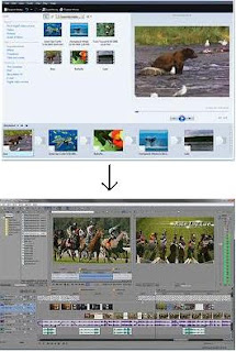
 In previous moving image projects I have always used Windows Movie Maker. However, we felt that this would not be able to best demonstrate our abilities and promote our trailer professionally. One of our group members introduced the software Sony Vegas Pro 9.0. Although, only they had experience in using it, I was willing to learn how to use such a complex software. Initially we had a total of 144 takes; this offered us a great selection enabling us to select the best footage which would best suit our narrative. The software was at first daunting but after a few demonstrations and tutorials I became confident in how to use it. The software offered a variety of effects and control in both sound and image which would not be available to us in movie maker. The process of editing began with selecting and creating an ordered sequence of footage. This provided us with foundations to our teaser trailer. The next step of editing involved cutting shot length and choosing transitions between scenes. Shot length became particularly important as we had trouble taking time off our trailer in order to fit typical conventions. The main transitions we used were straight cuts, this enabled our trailer to be fast pace and keep the audience entertained and anxiousness elevated. However, we also used other transition techniques such as flashes between short sequences of slides and a wipe cut. Transitions is the best way to demonstrate the difference between my earlier experiences in editing software’s to Sony Vegas, within movie maker we would have been limited to a set number of transition types. These include transitions such as dissolve and even a heart shaped fade. However, from the example of the heart fade you can see that it would affect the professionalism of our product. The flash transition was used to represent and highlight the flash back/ vision of a character. The wipe cut places emphasis a paranormal event within our trailer, this adds to the drama as it is an unexpected edit to the viewers. The software also offers support in HD resolutions, as I mentioned earlier we filmed in HD adding to the quality of our final piece. Other visual editing we did were similar to the editing styles used in fireworks; revolving around colour and contrast.


As well visual effects we also played close attention to the sound effects and music within our trailer. Including sound effects highlight key or dramatic areas within our trailer. For example, when the character bumps into the villain a heavy thump sound effect is used. We used the internet in order to find the mp3 file we would use within our trailer. We used two main music pieces, the first is used at the very begin of the trailer in order to establish an equilibrium. The second is much more cynical representing the disruption of the narrative. The music was edited alongside the visual piece in order to run smoothly alongside the transitions.

What have you learned from your audience feedback?

Once we had identified the potential target audience of our media production, they became the most significant opinion leader to the vast majority of any decisions made. We used a method known as the ‘spiral effect’, this is where we would produce some form of product or idea and then gather feedback from our chosen target audience and make the changes accordingly. This was a consistent process throughout the research, planning and construction of our final media products. 


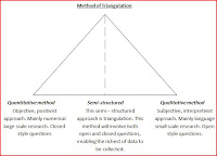
In order to collect the richest most valid and reliable data we used triangulation. This is a method where you incorporate both quantitive and qualitative research methods. An example of this which we used on numerous occasions is a semi-structured questionnaire. The advantages of this method is that the data collected can be easily quantified and therefore analysed in order to best interpret and use the data as well as giving the individual a chance to develop and allow their voice to be heard. For example, in our first questionnaire the main goal was to find out what our target audience wants from a teaser trailer, poster and website. This included a number of questions based on existing products, media content access/habits/influence and what content they would want from a film in general. One example of these questions is, what criteria do you consider when choosing a film? From this simple structured question we were able to use the results constructively and apply it to the production of media products. For example, results demonstrated that genre, cast, recommendations and narrative are the most important criteria when choosing a film. So we concluded that realistically, the cast of our film are likely to not be known at all due to expenses. However, we will be sure to have included those who are highly capable actors/actresses in order to meet the requirements of such standards as best we can. The genre we have already established as the correct decision due to it being the most popular choice. The narrative of our production will have to be to the best of quality; however, as we are producing a teaser trailer, we should give no chronological narrative away. This just one small example of how we have applied audience feedback to the success of our production.


To demonstrate the importance of audience feedback from the very beginning of the construction of our trailer we produced two rough cuts of our teaser trailer to set out a foundation to later be edited and developed as our final production.  This involved us taking a small focus group to watch the two trailers and then fill out a short questionnaire on the comparison between the two. This allowed us to not only determine which rough cut we should build upon but also what features of each trailer the audience liked or even how we could improve, covering means of editing, sequence, mise en scene, camera angles etc. This process provided us with choice of areas from both the rough cuts and working with the audience feedback to then further our progress. For example, one audience member said yes and four said that we did not include an appropriate amount of shot framing/ types, angles and movements. However, when asked why, they stated that the only issue of the three was the shot length. So we should be reflecting on our final product to address this issue and edit accordingly. This would enable us to build greater tension etc and adapt the actual teaser trailer length to a more conventional time.


So after taking into account the results from our rough cuts audience feedback we produced an initial drive of what is to be our teaser trailer. As well as developing and addressing indentified weaknesses our editing skills were improving as we gained experience. We then showed this draft to the same focus group to gain feedback of what we can improve. However, rather then asking particular closed questions we used an open discussion method; the audience would provide criticism verbally, allowing discussion points to be made and opinions built upon.  Each of the audience said they thought that the trailer standard had improves and was successfully persuasive. However, as well as gaining this positive feedback they also highlighted various areas for improvements. For example, the main concern was the actual length of the teaser trailer. The rough cuts run for around 1.55 minutes which is too long for a teaser trailer; our aim is to take it down to at maximum time of 1.30 minutes which is a typical convention of a teaser trailer. We initially found it difficult to address this problem as we have undertaken a lot of filming and find it difficult to take out scenes we are so happy with. These issues were brought to our attention through comments and constructive criticism from the focus group. Furthermore, an issue with the actual quality of our technology was identified, the resolution of our trailer changes, although very brief, this was noticed and was changed in order to provide the most professional standards of product.  


Within our group, each of us was very opinionated and was very keen to put across their own personal ideas and opinions. So, rather then battle against each other, a common research method we used was putting down each of our ideas and then letting the audience make the final decision. This was qualitative data which means that these results in the form of a tally chart allowing them to be easily analysed. Examples of when we used this method was when choosing a film title, production company name, soundtrack and slogan.


When approaching the feedback from my poster and website the primary feedback I gathered was from both my teachers and peers in my media studies class. This feedback mainly consistent of a step by step process of completing a product draft and then revealing it to them, they would then identify weaknesses and offer suggestions for improvements. I used these as a source of feedback as they had knowledge in areas which my general audience would not, for example, codes and conventions of the media products. An example of how I used this feedback is in my website, I printed off captions of each page of my website and asked my teacher and peers to comment. From this feedback I developed the continuity of my website.   


Lastly, we used audience feed back to evaluate the effectiveness of our teaser trailer. This was again the form of a questionnaire mainly involving structured questions and this was the most ‘to the point’ research method we used. The questions covered all areas from mise en scene, editing, camera skills etc. This was the final procedure in audience feedback and results were all positive proving the effectiveness of applying the audience feedback results.

How effective is the combination of your main product and ancillary texts?

Before I had even began to create neither my main task nor ancillary task I analysed an advertising campaign of a film from the same genre, I chose the movie ‘The Strangers’. This would enable me to grasp an understanding how existing media products interlink their products in order to then apply this knowledge to my main task of a teaser trailer alongside my two ancillary tasks. http://lewis-tillyer.blogspot.com/2010/09/analysis-of-strangers-advertising.html

Throughout my trailer, website and poster I focussed on creating similarities between them. I believe that I have successfully created continuity between my products as each can easily be identified as advertising the same media production.

Firstly, the title of the film is featured on all three of the products as expected. I believe this is one of the most important features of continuity as it provides an iconic identity of the film itself, instantly intertwining the products and recognised by the public. Originally, the first draft of my poster included the same font although it was a different colour. I did this as I thought it best suited the aesthetics of the poster. However, after close analysis I decided to use the original title as it stood out more from the page and consequently provide the audience with quick recognition. Also, I felt that having a consistency of the title between products was a key feature to a new film as it yet to form some kind of identity or place within the industry.

Other ways in which I feel the contribution of my tasks is effective is by including a slogan, ‘Every village has its secrets’. I feel the slogan itself is very effective as it places questions into the audience’s mind, such as what is the secret? It also has a large impact on the audiences living in smaller communities such as villages as it brings the events closer to reality, putting them in a vulnerable position as it questions whether secrets affect them. As the slogan is also written as a statement I believe that it has more of an impact as it is not only direct but also resembles a fact, there is no escape, the truth is kept hidden. However, although we included a slogan on both the ancillary task we decided not to include it on the teaser trailer. We did this as we wanted to place as much emphasis on the footage and film title itself, adding more text may distract the audience attention from the title.

On both the teaser trailer and the poster I have also included the production company logo which we had created. As this is clearly a new company we needed to make it clear to the audience of the logo in order to create familiarity with the company through exposure. For example, at the beginning of our trailer the logo is shown for a number of seconds, in order to be most effective for the purpose of the trailer we created a flash moving image of the logo, this adds to the professionalism of our products. While the logo is also featured on the poster, the image is very small due to following the conventional layout of existing posters.

The genre of the film is also suggested throughout the three products through methods such as font colour and low key lighting. The main colour scheme between the three is red, black and white. These are all colours typically associate with our desired genre, so were used to identify our product within this industry. Red suggests danger, blood, anger and the black connotes death, mystery, and the unknown, while white may suggest innocent and purity. As you can see throughout my products the main colour use is black and red. This is due to the dark nature of the narrative which the tasks are advertising. Within the trailer, an example with how we used colour is through the prop of the red balloon. As the child is holding the balloon it suggests that is upon her; close to her. We also used low key lighting was used to represent the disruption and tone of the trailer. Also, throughout my products any use of the colour white is surrounded by black. This was done in order to represent the struggle between good and evil, white representing the innocent being surrounded by darkness suggests that there is no escape, darkness has the dominant upper hand, this provides clues for the audience of the narrative of the full length picture which these products advertise.

Another effective feature of my productions is the use of image. Each of my productions features an image of the main villains’ prop of the mask. I did this in attempt to create a sense of iconography; people would instantly associate the mask with the movie itself. I wanted to represent the killer throughout my products. For example, this was the dominant image of my poster and I feel the use of editing and camera is very effective. Showing only a section of the mask implies that the character is well hidden so accordingly will not be easily guessed or identified by the audience. Also, being surrounded by darkness to one side suggests that the masked character is approaching from the darkness itself, implying his evil nature. The position of the shadow also highlights the character’s masks features which are almost distorted, suggesting the character has been through many physical contacts. I also decided to add the red tear onto the prop as this is commonly associated as the symbolic mark of a murderer, suggesting the character behind the mask is capable of killing. The mask itself suggests the character behind its identity is kept hidden from not only his victims but the audience, therefore the audience can not simply distinguish who the villain is, but instead it acts as an incentive to watch the film as well as adding a sense of mystery of the killer; a common feature of a thriller in particular. While images of the mask were used, within my website I also included a number of various images mainly based around victims or potential victims of the villain. This therefore creates the idea that while the villain is evident, consequences of his actions are still occurring, there is one particularly graphical image used on the background of one of my web pages. However, during my research I found that including such emotive images is common of my chosen genre. 

Another way I feel I have made my products effective together is through creating textural links or advertisement of each individual product. For example, in my film poster I have intentionally placed the website address in order to encourage the audience to indulge in further interest and research into the film and overall advertise the full length picture. From my website I have then also provided both my theatrical and teaser trailer in order to furthermore promote my film. I also created a sound link between my products. The soundtrack I used within my trailer I also included on my website.    

Also, throughout the productions I also kept in mind the target audience and certificate of the film. This allowed me to adapt my product in the best interests of the potential audience. Carrying out my research provided me with the information to do so. However, I also had to consider the laws and regulations of the certificate 15. So therefore, all three of my media products together or individually will appeal to the same audience.

In conclusion of the effectiveness of the combination of my poster, website and teaser trailer I truly believe that they fulfil the purpose of adverting the full length picture, I believe iconography and continuity play a major role in the success of such products so it may be questioned of the effectiveness of any media product such as this if looked at individually.

In what ways does your media product use, develop or challenge forms and conventions of real media products?

y research has provided me with the knowledge of typical conventions throughout existing media products in teaser trailers, posters and websites. Between the three of my media products I have consistently used, developed and challenge these conventions. http://lewis-tillyer.blogspot.com/2010/09/purpose-and-conventions-of-teaser.html

Firstly, the narrative of my teaser trailer follows the conventions of existing media products from the same genre. Although material from the film industry traditionally follows Todorov’s narrative stages, my research identified that this was not the case within all of horrors’. For example, there is more disruption and recognition of the equilibrium is not always evident. However, as I am producing a teaser trailer the narrative structure itself was kept unclear from the audience. This is typical of a teaser trailer as its purpose is to ‘tease’ the audience, by providing only segments of narrative stages the audience is left guessing and questioning what is going to happen. http://lewis-tillyer.blogspot.com/2010/10/our-stages-of-narrative.htmlThe content of existing trailers of our chosen genre mainly involved the disruption stages and the use of enigma codes. We also need to consider the genre of the trailer, for this reason our trailer consisted of a very short sequence of shots in order to establish the equilibrium and then a great deal of time on the disruption. This keeps the audience entertained and enticed to find out the reason behind the disruption or who is next. All these questions put into the audiences mind represent desired emotions of a horror trailer encouraging them to watch the whole length picture. For example, audiences of our trailer are left what happens to the main protagonist? Who the villain is?

As well as the narrative, another major convention of any teaser trailer not only horrors’ is the length. Typically the length of a teaser trailer is between 30 and 90 seconds. Originally we had difficulty reaching this target as we had a lot of footage (144 takes) and we were reluctant to lose footage we favoured. However, after much thought and audience feedback we identified that this was a major issue of our teaser trailer. So what we decided to do is create two versions of our trailer. One, being longer we used as our theatrical trailer and the shorter as our teaser trailer. After a lot of editing we eventually managed to cut the trailer a significant amount. In the end conforming to this convention improved our teaser trailer dramatically, making the whole thing more intense and fast pace.

Another way in which we conformed to conventions of existing products is the use of characters. From my research I identified three main character types according to Propp; the villain, donor, helper and the hero in such genres. In addition, we decided to only really represent the hero and villain within our trailer. However, while we follow typical conventions of the villain character i.e. male, tall and powerful, we have developed or even challenged the hero character type. We decided to make the hero female as this would be more effective based on the narrative of our story. Typically female characters follow stereotypes such as vulnerability and dependency, while our trailer represents the female character as independent and brave. We have conveyed this within our teaser trailer as even though the character is in potential danger she still strives to expose the villain and save her younger sister.

During my research, in particular the analysis of existing teaser trailer I found that horror teaser trailer typically used numerous transitions and visual effects in order to emphasise the featured events. When producing our teaser trailer we took this into account and therefore used a variety of transitions, for example, although we maintained a desired fast paced trailer using wipe cuts we also included transitions such as flash and wipe cuts. This adds to the effectiveness and allows the trailer look more professional. However, some visual effects used in horror trailer we just simply did not have access or the experience of generating due to the editing software used. As well as transitions shot types were also important. Throughout our trailer we use a vast number of shot types. However, one shot type we used which our trailer takes one step further of existing products is the close up of the child victims. We added this to our trailer as we felt it would have more of an emotive impact on our audience. However, one issue this generates is that it limits the time of day that the trailer can be shown, due to the access of age to the audience. 

Typically within a horror/thriller teaser trailer the use of sound use revolves around having one non diegetic sound track playing consistently throughout however increasing in pace as well as volume.  Also, they usually consist of a number of sound effects in order to emphasise key points of disruption within the trailer. Within our trailer we used two separate sound tracks developing typical conventions of existing products. We did this in order to make a clear distinction between the equilibrium and the disruption. We found this effect successful as it made the audience feel a false sense of security as well as demonstrating a strong sense of community central to the film’s narrative. http://www.youtube.com/watch?v=-TGKJ9MgCOQ However, once the disruptive soundtrack began the music became louder and more dramatic increasing with the timing of the edits.  We also used many sound effect, most of which consisted of a heavy bass line and even the use of parallel sound in a power cut. http://www.youtube.com/watch?v=BVRgEi6SooU&playnext=1&list=PLBC26F0701C1D0314

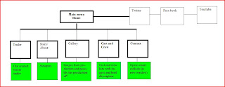
The actual navigation around my website follows a typical map of any website. However, due to my past experiences in the creation of websites the navigation it is quite simplistic. Nevertheless, this has proven to become some what of an advantage. My website is extremely easy to pilot around the pages, making the website effective for all audiences whether they are confident in the ability to use a website or not.
 
From my research I also found that websites typically had a range from four to eight pages. For this reason I decided to include six pages, I felt that this enabled to provide the most important information without adding unnecessary information which are likely to be avoided. The actual content in which each page provides was selected from my past experiences with typical film websites, I also decided to include and index (welcome) page as in my research I found that although independent films often did not include this page, more mainstream websites did. So therefore, by including this page I felt that my production appeared more professional. One way in which the content of my pages has developed typical conventions is by including both my teaser and full length trailer rather then just the one. This gives the audience more control and choices to how they use the website, for example, those who have little time are likely to choose the teaser, while those who wish to gain a more detailed interpretation of the film with the time have the option to do so.

Also, relating to the navigation around my website, I decided to place my navigation bar towards the top of each individual page. From my research I also found that in the horror genre in particular, the navigation bar ran horizontally, I followed this convention as a vertical takes up a large portion of space so would take away the audiences attention from the main image or content of the page itself. Just above the navigation bar I placed the final edited title of my movie, this is an important feature of my website as it creates continuity between the other products. I also noticed from my research that websites often used a number of visual effects and behaviours. However, due to the program I used to create my website many of these option available were quite tacky, for this reason I therefore decided to only use those which did not have an impact on the professionalism of my product. One example of where I used visual effects was in my title; a fast paced light skipping within the letters. I used this behaviour as it represents a struggle between good and evil, the light resembling good is trapped and surrounded by evil.

When I first designed my website I used one image/wallpaper consistently throughout all but the index page of my website. This was due to me using mini pages rather then individual pages. After, looking back at my research I found that mainstream horror websites did not use this format of page; instead each page was independent and included a different picture. Due to the effectiveness of the convention I decided to follow this method, on each page I included a different picture while still representing the same meaning and consistency of genre representation. I achieved this by including typical features of mise en scene sc as expression, props and lighting. As well as this I also made my website interactive, i.e. the audience selects what to view and navigation around the site.  

However, one convention I noticed was typical of horror websites was that between the transitions of pages, a short piece of footage from the movie is played. However, from navigating around the websites myself I would often skip this footage as it became more of an annoyance rather than a positive feature. Other issues I faced including this feature was that I felt we had not gained enough footage to include it on the website as similarities would be evident between the trailers. As well as this, the program I used did not offer the tools in order to do so. If I was to complete the website again, I would consider adding this convention however, due to my technology restrictions this was not possible.

The last of my tasks within my media production I created was my poster. I decided to predominantly follow typical conventions and layouts of existing products due to the limited features on a poster and in order to make it clear to the audience what product it is. Throughout my poster I focussed on suggesting and implying the narrative of our film throughout the media language. I achieved this in many ways, for example, like my previous products mentioned I used features of mise en scene typical of my genre i.e. props (mask), colour (red, white and black), and font. As well as this I include a slogan; ‘every village has its secrets’. I believe this is effective as from my research I found that other posters included a slogan which may get the audience to feel vulnerable, apply the situation to their life. The slogan I have included does exactly this. Firstly, any audience member that reads it and lives in a small town or village can relate to the location the film is it, the idea that secrets are being hidden is a concern or worry to any person, every person has done something they wish to be kept hidden. Therefore, it causes the audience to question the security of themselves.

Evaluation presentation


As a group we decided create a presentation evaluating our final teaser trailer focussing areas in narrative, camera, editing, mise en scene, sound and representations.

Final Poster...

Theatrical trailer. . .